Image Optimization Workflow: Choosing Dimensions, Format and Compression
A practical, step-by-step workflow for optimizing web graphics: selecting display dimensions, choosing modern formats, tuning compression, and preventing visual artifacts.
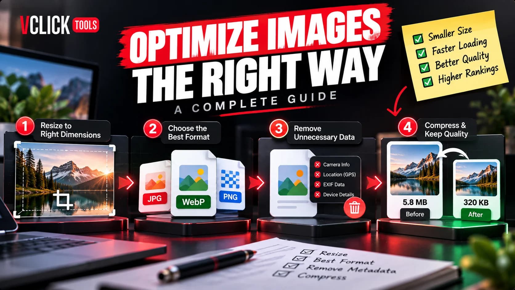
When web developers and content creators discuss website performance, images are almost always the first topic mentioned. Photos, diagrams, and illustrations frequently account for more than half of the total byte weight of a modern webpage. When images are improperly prepared, visitors on mobile networks or slower broadband connections experience sluggish loading, delayed visual rendering, and jarring layout shifts.
Yet many publishers treat image optimization as a single rushed step: taking an original high-resolution photo from a stock library or camera and running it through an aggressive compression tool at the last minute. This one-dimensional approach often produces either bloated files that slow down browsers or blurry, pixelated graphics that look unprofessional on modern high-density screens.
A resilient image optimization workflow is an end-to-end editorial process. By systematically choosing target dimensions, selecting the most suitable file format, stripping redundant camera metadata, and tuning compression levels, you can deliver crisp, visually compelling graphics that load cleanly without wasting bandwidth.
Why Image Optimization Requires More Than Just File Compression
File compression algorithms are mathematical tools designed to discard redundant data. When you tell a compression algorithm to reduce file weight, it tries to preserve the existing pixel grid while lowering fidelity where the human eye is least likely to notice.
However, if you feed a 24-megapixel camera file (measuring 6000 by 4000 pixels) into an online compressor without first resizing it, the compression engine is forced to compress millions of unnecessary pixels. The resulting file might drop from 12 megabytes to 1.5 megabytes, but serving a 1.5-megabyte file inside an 800-pixel blog container remains extraordinarily wasteful.
Effective optimization requires addressing geometry, format suitability, and compression in tandem. Skipping any of these stages creates unnecessary trade-offs between visual quality and performance.
Step 1: Establish Display Dimensions Before Touching Compression
The single most impactful step in reducing image weight is establishing the maximum physical dimensions your website's layout actually requires. Browser viewports rarely require billboard-sized graphics:
- Blog Content Columns: Standard desktop editorial layouts rarely display content wider than 700 to 900 pixels. Preparing an image at 1600 pixels wide (to accommodate high-density 2x retina displays) is more than sufficient.
- Full-Width Hero Banners: Desktop hero banners spanning the entire viewport rarely need to exceed 1920 or 2560 pixels in width.
- Author Avatars & Thumbnails: A circular headshot displayed at 80×80 pixels should never be loaded from an original 1200-pixel profile photo.
Before compressing an image, use a dedicated tool like the VClick Tools Image Resizer to scale your source graphic down to realistic display boundaries. Scaling down physical dimensions immediately removes millions of unneeded data points before encoding even begins.
Step 2: Choose the Right Image Format for the Content Type
Different image formats use fundamentally different compression mechanics. Choosing the wrong format for a specific graphic type leads to immediate bloat or visual degradation:
- Continuous-Tone Photographs: Photographs containing millions of blended colors, soft shadows, and complex textures belong in JPG or modern WebP. These formats excel at compressing realistic scenes smoothly.
- Geometric Graphics & Logos: Icons, brand logos, line art, and software screenshots with crisp typography belong in PNG or lossless WebP. Lossy compression applied to sharp geometric boundaries creates noticeable smudges.
- Graphics Requiring Transparency: If an illustration or badge must sit over a colored or variable background, you need alpha channel support. PNG or transparent WebP are standard choices.
When working with legacy assets, you can use our Image Format Converter to switch between containers based on the exact visual needs of your layout.
Step 3: Strip Unnecessary Metadata and EXIF Headers
Every photo captured with a modern smartphone or digital SLR camera contains embedded header data known as EXIF (Exchangeable Image File Format). This metadata includes:
- Camera make, model, lens type, and focal length
- Exposure settings, aperture, ISO, and shutter speed
- Timestamp, color space profiles, and thumbnail previews
- Precise GPS location coordinates where the photo was taken
While this data is valuable for photographers managing catalog archives, it adds tens or hundreds of kilobytes of completely invisible bloat to a website file. Furthermore, publishing GPS coordinates from office or home locations poses real privacy hazards. Running your photos through an EXIF Remover eliminates this overhead safely before public deployment.
Step 4: Fine-Tune Compression Levels to Prevent Visual Artifacts
Compression is not an all-or-nothing toggle. Most compression engines operate along a quality scale from 0 to 100. Understanding how this slider behaves helps you avoid the twin pitfalls of over-compression and under-compression:
- The 80% to 85% Sweet Spot: For most photographic web images, reducing quality from 100% to approximately 80%–85% typically reduces file size by 50% to 70% while remaining visually indistinguishable to the human eye under normal viewing conditions.
- The Diminishing Returns Zone (90% to 100%): Compressing at 95% preserves nearly every microscopic high-frequency byte, but results in a file that is two to three times heavier than necessary.
- The Artifact Danger Zone (Below 60%): Dropping below 60% often triggers visible defects: color banding across skies and gradients, blocky square tiles in shadow areas, and mosquito noise around high-contrast edges.
Understanding Lossy vs Lossless Compression in Practice
It is helpful to clarify what happens mathematically during encoding:
Lossless compression reorganizes image data more efficiently without discarding any color information. When the browser decompresses the file, every single pixel is mathematically identical to the original master. Lossless compression is essential for technical diagrams, crisp typography, and medical or scientific graphics where pixel-perfect precision is required.
Lossy compression permanently eliminates subtle color variations that the human visual cortex struggles to perceive. Because the human eye is far more sensitive to brightness (luminance) than to subtle color shifts (chrominance), lossy encoders discard chrominance data first. This achieves dramatically smaller files with minimal perceived quality loss when applied responsibly.
Comparing Before-and-After Images: What to Look For
Never deploy compressed graphics without performing a quick visual sanity check. When auditing an optimized image:
- Zoom to 100%: View the image at actual pixel dimensions on your screen. Do not inspect it zoomed out to fit a tiny window.
- Examine High-Contrast Boundaries: Look where dark text or silhouettes meet light backgrounds. Check for fuzzy, smudged halos.
- Check Smooth Gradients: Inspect skies, sunsets, and soft studio backdrops. Ensure the gradient flows smoothly without jagged, stepped color stripes.
- Verify Fine Textures: Look at hair, fabric, foliage, or architectural brickwork. Ensure textures remain defined rather than turning into flat plastic blobs.
Executing Your Optimization Workflow with VClick Tools
You can execute this complete optimization pipeline directly in your browser without installing heavy desktop photo editors or paying for cloud conversion subscriptions. You can use the free VClick Tools Image Compressor to adjust compression levels in real time while comparing before-and-after file weights.
Because VClick Tools runs entirely inside client-side browser memory via HTML5 Canvas and WebAssembly, your photos are never uploaded to an external server. This ensures complete privacy when handling unreleased product mockups, proprietary client screenshots, or personal family photography.
To support your broader publishing workflow, you can also convert between modern web formats with our JPG to WebP converter, standardize dimensions with the Image Resizer, and explore our complete library of utilities in the Image Tools hub.
A Pre-Upload Image Checklist for Web Publishers
Before uploading any visual asset to your content management system or web server, verify these five practical checks:
- Is the image scaled to realistic display dimensions? Never upload raw 4000px camera files for blog body illustrations.
- Is the file in the most suitable format? Use WebP or JPG for photos; use PNG or lossless WebP for transparent logos and crisp UI screenshots.
- Has unnecessary EXIF and GPS metadata been removed? Protect user privacy and reduce hidden overhead.
- Did you inspect the image at 100% zoom? Verify that text remains sharp and gradients do not display harsh banding.
- Is the resulting file size proportionate to its layout role? Thumbnails should be under 30 KB; standard editorial illustrations should generally remain under 100 KB; hero banners should target 100–200 KB.
Convert JPG and JPEG images to PNG directly in your browser. Single or bulk conversion with zero server uploads.
Convert heavy PNG graphics to compressed JPG photos locally with custom quality and background matting.
Convert legacy JPG/JPEG images to next-gen WebP format locally with adjustable quality and bulk ZIP export.
Convert heavy PNG graphics and logos to lightweight WebP files while preserving full alpha transparency.
Frequently Asked Questions
Common editorial inquiries and technical answers.
VClick Tools Editorial Team
Editorial & Content Optimization TeamEditorial and research specialists creating actionable, privacy-first guides, search optimization workflows, and documentation for VClick Tools.